APL logo
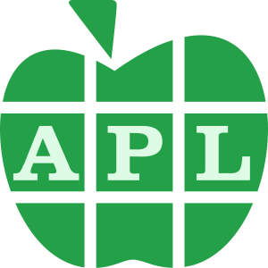
The official APL logo was designed by Adám Brudzewsky and was adopted by BAA at the BAA Webinar on May 19, 2022, thereby concluding a nine months long process.
The logo has no legal restrictions on usage and is available in vector and bitmap formats. Many kinds of merchandise featuring the logo can be bought online.
The logo can be experienced in various realistic web contexts, including as favicons:
- In a gallery of programming language logos
- On a mock conference website
- On a mock programming competition website (in monochrome)
Though a logo has now been chosen, this page documents the candidate designs for reference.
History
At the September 9th 2021 BAA webinar, the effort to adopt a universal vendor-agnostic logo for APL was initiated. This APL Wiki article was used as a portal for the work. Submission of concept work ran until the end of 2021, and voting for logos ran until 2022-02-10 at 16:15 UTC.
At the 2022-02-10 BAA Webinar, the results were revealed and discussed. Ignoring obvious spam votes, the clear winner was Nested Bitmaps. For a second place, APL Matrix seems to have won, unless counting Lamp Box and Lamp Rho Downstile Box are counted as a single proposal for small-size and larger uses respectively.
It was decided to go with the Nested Bitmaps concept for now, with APL Matrix as a backup in case Nested Bitmaps is found to conflict with Apple Inc.'s logo. It was also observed that Lamp Box, modified to have sharp corners and a darker background, could be seen as the bottom left part of APL Matrix, for use at small sizes.
As with all candidates, the winners are not considered final designs; exact execution, colours, and fonts (including whether or not to stylise the letters "APL" as ⍝⍴⌊. During the 2022-02-24 BAA webinar, it was decided to go ahead with the Nested Bitmaps logo, and a couple of attendees were tasked with finding pricing for professional designers to polish it. On 2022-03-11, BAA hired such a designer for the task.
The designer went with a uniformly coloured apple, which led to the idea of shrinking the letters to fit them entirely inside their blocks, avoiding the issue of touching the background colour. Finally, during the 2022-05-20 BAA webinar, the attendees voted to replace the blocky bitmap font with a traditional Clarendon, matching the old IBM manuals, and the new Fortran logo.
Criteria
The choice of logo concept was to be done while keeping in mind that a common logo is intended for branding demonstrations, presentations, systems, documentation, and other visual materials. Its core purpose is to proclaim that "this is APL in action". Furthermore, it should work as a favicon (possibly slightly modified to fit the technical constraints) as well as in banners, including on both dark and light backgrounds. It was also seen as beneficial if the final logo could easily be adapted to a monochrome form, for usage in printed materials, stencils, and existing designs. The chosen logo does indeed permit such uses.
It was established that the ideal logo was signal that:
- this algorithm/product/person/company uses APL for increased brand recognition
- APL is a programming language as opposed to any of the other things named APL
- APL is a sophisticated IT tool which delivers tangible benefits
Logos based on apples
 50 Years Apple
This is based on the logo that Dyalog Ltd. commissioned for APL's 50th anniversary, which was inspired by the original "I like APL" apple motif; the green colour also recognises this original motif. As with some of the other suggestions, the simplicity and single colour means that it would still work well when shrunk to the size of a favicon and could be rendered in black and white without loss of detail.
 Angular Textured Apple
This apple-based logo is designed by Aaron Brudzewsky. It uses realistic textures exclusively, for a crisp fresh look. The angles and orthogonally constructed letters hint at APL's emphasis on orthogonal arrays.
 Circles
This is stylised enough not to get in trouble with Apple Inc, while still being a recognisable development of the traditional symbolism. The italic Clarendon and the Carbon red and green are honouring APL's IBM heritage.
 Cube Apple
This is a cube, which is a common APL motif, e.g. used for APL2 (including the book APL2 at a glance), APL*PLUS and Dyalog APL. However, one quarter has been modified to resemble a leaf, thus making the cube into an apple, another common association with APL. The leaf is supposed to hint at the Del which symbolises function definition and has been used in application icons for APL+ and APLX. The green colours come from IBM's modern Carbon design to honour IBM's role APL's history. The lettering spells out "APL" while also hinting at APL's usage of special glyphs; here ⍝⍴⌊ which look very close to the forms found in the widespread APL385 Unicode font.
This may be too reminiscent of the Dyalog APL application logo to be a general and independent APL logo.
Jokerman
 Logo from the LinkedIn APL - A Programming Language group featuring the letters "APL" in the Jokerman font, but with the dot in the letter L replaced by an apple.
 Nested Bitmaps
This logo is a reinterpretation based on the classic APL apple with the leaf styled as a filled Del which symbolises function definition and has been used in application icons for APL+ and APLX. The green colour comes from IBM's modern Carbon design to honour IBM's role APL's history. The apple is subdivided into a rectangular pattern which is supposed to invoke a matrix and the middle row in turn holds three 4-row, 3-column Boolean matrices to spell out "APL" as bitmaps. This matrix of matrices hints at APL's multi-dimensional nested arrays. The logo exists in various variations.
This logo relies on contrast contrasts in a way that necessitates having two parallel logos, one for light backgrounds and one for dark backgrounds.
 Script apple
This apple logo is a basic update of IBM's classic "I like APL" promotional, but with the leaf styled as a filled Del which symbolises function definition and has been used in application icons for APL+ and APLX. The colours comes from IBM's modern Carbon design to honour IBM's role APL's history. The script lettering commemorates APL's origins as handwritten notation and at the same time symbolises the ease with which APL is written. On dark backgrounds, the lettering would be produced in white rather than black. The logo also exists as a filled green version.
For good and for bad, Dyalog Ltd has already adopted a slight variation of this for use as the APL Seeds logo (user meetings, events and information specifically for new APLers) – see here for an example and the detail makes it harder to shrink. Some think the filled version is more reminiscent of a bell pepper than an apple.
Logos based on grids
 APL Matrix


This logo is inspired by the logos of TypeScript, JavaScript, and WebAssembly, being lettering along the bottom of a theme coloured square. The APL logo is distinct in its usage of Lamp Rho Downstile and in splitting up the square into subsquares to hint at APL's multi-dimensional arrays. The colour of the centre square is from IBM's Carbon design and occupies the saturated green gap in the rainbow of programming language logos. For small icons, the lettering can be left out. As an alternative to the Lamp Rho Downstile, the letters could be shown in a proper font like the traditional IBM user guide cover sheet font Clarendon (as used in the Fortran logo), or the modern IBM programming font Plex Mono.
 APL Rotated Array

Following the central ideas of "Array-Based" Language, the three letters of the name, and the most established APL logo to date (the APL Wiki one); This logo tries to encompass and simplify all of them, while the rotation and the negative space hints the nature of the multi-dimensional arrays that APL is founded on. The colour is green, hinting the IBM Carbon green lettering, begin friendly with hard reproduce surfaces that will need a black-and-white version, and also becoming the only green logo in the programming language landscape. Also exists in a darker version. Made by OOQQ
This logo does not spell out "APL" and while there are three central circles, they are likely too far apart to frame one letter each. A solution, would be to put them on the diagonal
 APL Wiki

The APL Wiki logo encapsulates features of APL, is visually striking and takes an interesting new approach over traditional apple or cube designs. Its use here has already established its independent, community-wide use. It works in a variety of sizes and its simple black and white palette makes it suitable for all media forms. This logo could be enhanced with the letters "APL" either underneath, or within the middle dots of the middle row, and optionally stylised as the classical APL glyphs ⍝⍴⌊. It could also be recoloured in IBM's modern Carbon green.
Clearly, if you visit the APL wiki you'd expect to see the APL logo - and perhaps you already do.
Logos based on the letters APL
APL Array
This logo represents an array and the letters A, P, and L, which together make up the array.
APL Germany
The icon used by APL Germany.
It might be unclear whether the name is "ALP" or "APL".
 Direction and Magnitude
The colors are taken from the Canadian flag.
 Display matrix
This is the output from the classic DISPLAY function when applied to the matrix 1 3⍴APL.
If placed in the matrix of other logos, it would stand out a bit because of its simplicity. A good graphic designer could stylize it a bit, perhaps removing some white space, a little kerning on the letters, some color, etc. The font could also be replaced with an older font where the characters are more italicized or even underscored. The frame might be improved if the arrows and the lines were connected without breaks.
 Ligatures


This is Jon McGrew's reworks of an original design by Joseph DeKerf that used the ITC Avant Garde font. The original is arguably ambiguously APL/ALP, hence the alternative versions.
 Modern
This logo follows the style of the logos of JavaScript and its relatives/derivatives, but can optionally be made to stand out more with the distinctive power glyph.
The star when used in a flag-like context, may have negative connotations to some.
 Parallel Lines
This logo is from the cover of the original edition of Paul Berry's SHARP APL Reference Manual.
This might appeal to those who have fond memories of the rather brilliant book, some would consider the design very dated, and it can be hard to read unless you already know that it says "APL". It also doesn't render well when small, and would need modification to work in a monochrome setting.
 Plain Ellipse
This is a plain ellipse designed by Juda Brudzewsky. It is similar to the logo of PHP, using the warning red from IBM's Carbon design. The font is reminiscent of Clarendon used for the covers of IBM's manuals at the time when APL first appeared. Note that APL\360's name was originally always styled in italics, technology permitted.
If this logo concept is chosen, it should have a different colour than red, to avoid being overly similar to the logo of APL Media.
APL Shape 

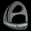
The thinking here is an APL Logo for general use and promoting the APL language has to be distinctive (so people notice and remember it), has to include the letters APL (as the people we want to attract will mostly not know what APL is), has also to include the words "A Programming Language" (to destinguish it from other instances of "APL") and should ideally be in 3D or use some other means to emphasize that APL can process Arrays with complex structures and multiple dimensions. The challenge is to get all that into 120 pixels - assuming that is indeed the typical size for the Logo in use. This is a first stab and lots of variants of this basic idea are possible, bronze with black or white backgrounds, for example; which I happen to like but has the additional benefit that no other Program Language Logos use this colour. It shows up well at 16 pixels on a white background, but not on black, sadly.
The phrase "A Programming Language" estabishes that the main logo says "APL", but further work to emphasize this point would be useful.
Letters From the Cube 


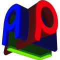
Simple 3D logo from the imagination. The variants on the right are renderings of 4-by-4-by-4 Binary voxels. Each letter A, P, and L, are projections of that cube as follows:
     b←4 4 4⍴(5 ¯2 6 ¯3 1 ¯8,23↑12⍴¯3 1)\'⎕' ⋄ (⊣/b)(⊣⌿b)(⊢/[2]b)
 ⎕⎕⎕⎕  ⎕⎕⎕⎕  ⎕
 ⎕  ⎕  ⎕  ⎕  ⎕
 ⎕⎕⎕⎕  ⎕⎕⎕⎕  ⎕
 ⎕  ⎕  ⎕     ⎕⎕⎕⎕
It might be unclear whether the name is "ALP" or "APL".
Logos based on APL glyphs
 3D Lamp Rho Downstile
This is a variation on the APL Germany icon, created by Tobias Wessels after Dieter Kilsch proposed it during the APL Germany meetup in November 2021. It takes the idea of using ⍝⍴⌊ as stylised letters "APL" and combining them into a 3D structure, alluding to APL's multi-dimensional arrays. It should be noted that it is intended as a rough draft, and that both final design and colour choices are subjust to evaluation by a professional logo designer.
 Lamp Box
This back-to-basics logo consists of a boxed Comment glyph, which is recognisable for all APL programmers. Non-APLers should be able to guess with language it represents based on it also being a stylised A for APL (and removing P and L makes include A+ better). It uses the IBM green but works fine when rendered in black-and-white or black-on-bright or white-on-dark. It also remains very legible in small sizes, like when used as a favicon.
This could be used in combination with Lamp Rho Downstile Box, this one being used for small sizes like for favicons.
Lamp Rho Downstile
IBM Carbon green lettering of "APL" stylised as APL's glyphs ⍝⍴⌊ in a manner that is very close to the forms found in the widespread APL385 Unicode font.
Lamp Rho Downstile Box 

A version of the Lamp Rho Downstile logo in a box with matching rounded corners. This has the benefit of working well in 16px icon size, but can also be custom drawn as pixel art. Variations include a brutalist version and zoomed pixel art with or without faint grid.
This could be used in combination with Lamp Box, that one being used for small sizes like for favicons.
 Quad APL
This is the design by LdBeth that plotted by the MetaPost program below. It is composed visually by Quad, And, Circle (Pi), Left Tack, and forms the stylized "APL". One day he needs an icon for his APL keyboard layout, and he spent an hour to do the sketching and wrote the code in his favorite font design tool MetaFont. The right one is the old, original one. There might be alternative glyphs, and he will gladly accept any interesting suggestions for improvements.
% show bound box
prologues := 2;
beginfig(1);
  % edge
  e=5;
  a=40;b=28;
  % misc points
  m=0.3a;n=0.5b;t=2;
  % center
  z0=(e+n,e+0.4a);r=7;
  % quad
  z1=(e,e);z2=(e,a+e);z3=(b+e,a+e);z4=(b+e,e);
  % and
  z5=(e+t,e+m);z6=(e+n,e+0.8a);z7=(e+b-t,e+m);
  % pi
  z8=z0+(0,r);z9=z0+(r,0);
  z10=z0-(0,r);z11=z0-(r,0);
  % left
  z12=(z1+z4)/2;z13=z10-(0.3b,0);
  % draw
  pickup pencircle scaled 3;
  draw z1--z2--z3--z4--cycle;
  draw z5--z6--z7;
  draw z8..z9..z10..z11..cycle;
  draw z0--z12; draw z10--z13;
endfig;
end
This logo may be too cryptic, as neither the name APL, nor individual APL glyphs are very distinguishable.
