APL logo
As of November 2024, APL does not have a logo like many other programming languages do. After a consensus at their September 9th 2021 webinar, BAA will head an effort to adopt a universal vendor-agnostic logo for APL. This article collects draft proposals for the universal APL logo. Feel free to add your own.
To leave feedback on or ideas for the existing proposals, see the Discussion page.
Proposals
Cube Apple
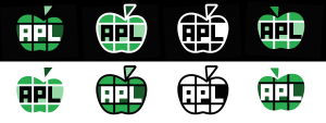
This is a cube, which is a common APL motif, e.g. used for APL2 (including the book APL2 at a glance), APL*PLUS and Dyalog APL. However, one quarter has been modified to resemble a leaf, thus making the cube into an apple, another common association with APL. The leaf is supposed to hint at the Del which symbolises function definition and has been used in application icons for APL+ and APLX. The green colours come from IBM's modern Carbon design to honour IBM's role APL's history. The lettering spells out "APL" while also hinting at APL's usage of special glyphs; here ⍝⍴⌊ which look very close to the forms found in the widespread APL385 Unicode font.
Nested Bitmaps
This logo is a reinterpretation based on the classic APL apple with the leaf styled as a filled Del which symbolises function definition and has been used in application icons for APL+ and APLX. The green colour comes from IBM's modern Carbon design to honour IBM's role APL's history. The apple is subdivided into a rectangular pattern which is supposed to invoke a matrix and the middle row in turn holds three 4-row, 3-column Boolean matrices to spell out "APL" as bitmaps. This matrix of matrices hints at APL's multi-dimensional nested arrays. The logo exists in various variations, and each comes has a version for light backgrounds and one for dark backgrounds.
Script logo
This apple logo is a basic update of IBM's classic "I like APL" promotional, but with the leaf styled as a filled Del which symbolises function definition and has been used in application icons for APL+ and APLX. The colours comes from IBM's modern Carbon design to honour IBM's role APL's history. The script lettering commemorates APL's origins as handwritten notation and at the same time symbolises the ease with which APL is written. On dark backgrounds, the lettering would be produced in white rather than black. The logo also exists as a filled green version.
Parallel Lines
This logo is from the cover of the original edition of Paul Berry's SHARP APL Reference Manual.
Ligatures
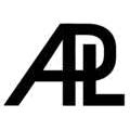
This is Jon McGrew's reworks of an original design by Joseph DeKerf that used the ITC Avant Garde font. The original is arguably ambiguously APL/ALP, hence the alternative versions.
Display matrix
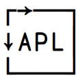
This is the output from the classic DISPLAY function when applied to the matrix 1 3⍴APL.

